I Need to Rant About the Azores Flag
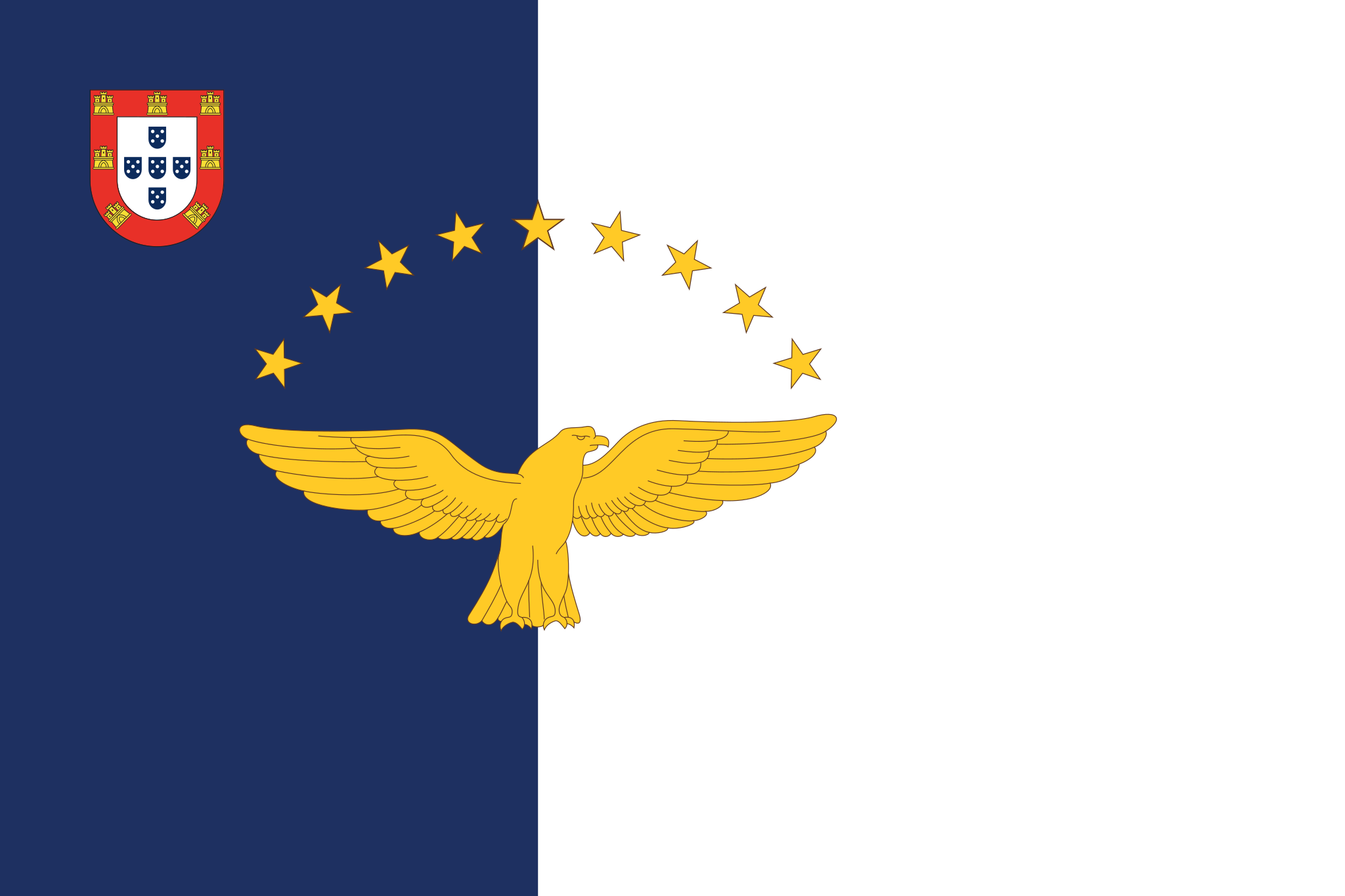
We need to have a talk about the flag of the Azores. It is in my unproffessional opinion that this flag is the greatest flag to ever be designed.
The Azores is an autonomous region of islands located off the coast of Portugal, and by "off the coast" I mean halfway across the Atlantic. If you’ve never heard of this tiny archipelago, all you need know for now is that it exists, it’s Portuguese, and its flag is pictured above.
The Design
Before we can talk about why this flag is great, we first need to understand what it is and what it is saying.
Physically
The flag sits at a 2:3 ratio, meaning its width is 1.5x its height. It has a vertical 60/40 split, the hoist (left) side being a deep navy blue, and the fly (right) being a perfect white. On the split line sits a golden goshawk spreading its wings, which is in fact not an eagle (you learn something new every day), above which is an arch of nine stars. On the top-left corner sits the Portuguese coat of arms.
Symbolically
The 2:3 ratio, 60/40 split, and the coat of arms are all nods to the islands' link to Portugal. The nine stars representing the nine islands on the archipelago.
The golden goshawk spreading its wings serves as a powerful symbol of strength, freedom, and discovery.
Dissection
The goshawk
The first thing I wanna mention is the thing with the golden goshawk... it's not even native to the islands. Okay, so here's what happened: When the Portuguese arrived in the 15th-century, they named the islands 'Açores' because they saw birds they thought were goshawks. Spoiler alert: they were actually buzzards. The islanders literally put a bird on their flag that doesn't exist there because of a birdwatching error. It's still there today, though, and it looks dope as hell, so I have to respect the commitment to the bit.
Complexity arguments
I've seen many people criticize flags like the Azores for being "too complicated", but I could not disagree more.
There's a trend in recent decades I've noticed among many hardline vexillologists who take design rules (like those from NAVA) way too literally. Sure, keeping it simple and using under three colors are good general guidelines, but obsessing over them misses the point of a flag.
The ultimate goal of a flag is identity. A great flag should communicate a shared history and culture while also being unique enough to be instantly recognizable. This is why I believe, among many unpopular opinions I hold, that seals on flags are not always bad. It's only when the seal the only thing on the flag is when it's bad.
Take the flag of Florida. It has a detailed seal, but it actually works because of the bold red saltire behind it nodding to the Spanish Empire. No other flag in the Union has that specific look, making it instantly recognizable.
The Azores nailed this balance. And, in my honest opinion, it's the perfect amount of complexity. It looks good from afar while being detailed up close. It tells its story and it tells it well. Any simpler and you're just gonna have the S.H.I.E.L.D. logo.
The colors
When I was first looking at the Azores flag next to her mother nation's, one of the factors that really made me fall in love was the color scheme: the Portuguese flag using red & green while the islands use a blue and white. At first I thought it was just a way to contrast each other when flying next to each other... I could not have been more wrong.
Back in the 1830s, Portugal was going through a bit of a civil war. Queen Maria II’s loyalists fled to the Azores and headquartered their government-in-exile there. This loyalist faction adopted a brand new blue and white vertical split flag. When they won the war, that became the official flag of Portugal.
Fast forward eighty years to 1910: Portugal overthrew the monarchy, established a republic, and replaced the blue and white flag with the modern red and green one. The Azores, still fiercely proud of their pivotal role in the civil war (and now a bit salty, if we're being quite honest), kept the historic blue and white for themselves.
End
This concludes my completely unnecessary breakdown of a flag of a territory I'm quite confident almost none of you have heard of. Until the next one!